
Heartwood Home Stewards
Building a brand around trust, relief, and the meaning of home.
Heartwood Home Stewards was preparing to move from concept to launch with a service designed to help older adults remain confidently in the homes they love, while relieving adult children of the ongoing responsibility of noticing, tracking, and coordinating repairs, maintenance, and household needs.
The business had a strong underlying idea, but needed a clearer name, stronger positioning, and a cohesive brand system before entering the market. The challenge was not simply to make the business look more polished. It was to help people quickly understand a relatively unfamiliar service, build trust with two closely connected audiences, and communicate the emotional value behind a very practical offering.

The Challenge
Heartwood sits at the intersection of home maintenance, aging, independence, and family caregiving.
Older adults want to remain independent and in control of the homes they cherish. Their adult children want reassurance that those homes are safe and well cared for, but can find themselves carrying the ongoing mental load of noticing what needs attention, remembering what needs to be done, and coordinating repairs.
That created a delicate brand challenge.
The business needed to feel capable and trustworthy without becoming clinical or institutional. It needed to acknowledge the realities of aging without speaking down to older adults. And it needed to offer adult children a genuine sense of relief without building the message around fear, decline, or loss of independence.
The original name, Heritage, also needed to change. While it suggested history and continuity, it did not create enough distinction within the broader home-services landscape or fully capture the deeper emotional role the business wanted to play.

The Strategic Foundation
The brand strategy centered on a simple idea: this was not merely a service for managing repairs. It was a service built around stewardship.
The brand needed to communicate warmth, reliability, respect, and relief while reflecting the high level of care Heartwood intended to provide. The messaging therefore focused less on individual maintenance tasks and more on the larger promise behind them: helping older adults feel confident in their homes while easing the constant responsibility and worry carried by the people who care about them.
This positioning shaped everything that followed—from the new name and message hierarchy to the identity, photography direction, and launch materials.

Naming Heartwood
The new name needed to feel rooted, enduring, and emotionally connected to the idea of home.
Heartwood refers to the strong inner core of a tree—the part that gives it structure and resilience over time. The name brought together ideas of strength, permanence, history, and care while feeling warm and human rather than technical or corporate.
It also created a natural connection to the emotional significance of home: not simply a property to maintain, but a place shaped by history, independence, memory, and everyday life.
Paired with Home Stewards, the name helped move the business beyond generic home management and toward a more distinctive idea of trusted, ongoing care.
Creative Direction
The visual system needed to feel calm, reassuring, capable, and human.
The design direction balanced a clean, contemporary foundation with subtle touches of tradition, helping the brand feel polished without becoming formal or distant. Readable typography, a refined color palette, and a restrained graphic system created a sense of clarity and steadiness while still feeling warm and approachable.
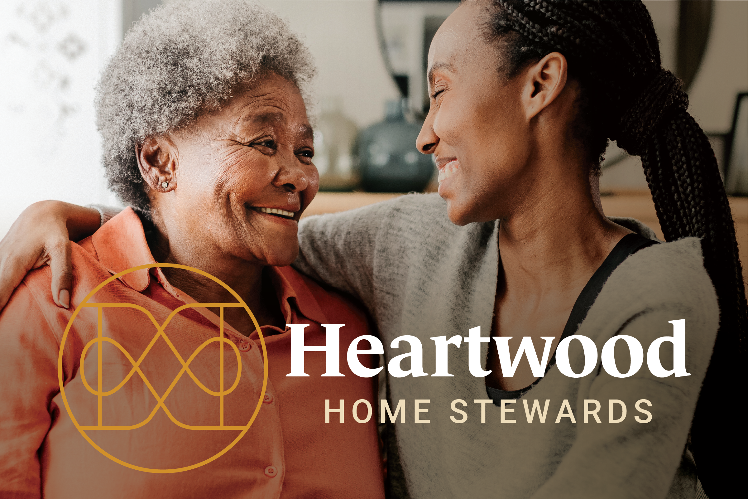
Photography played an important role in establishing the emotional character of the brand. Rather than focusing primarily on repairs or maintenance tasks, the imagery centered on lived-in homes, familiar moments, and quiet expressions of connection and care.
The goal was to create a brand that felt respectful and empowering—never clinical, infantilizing, or overly sales-driven.
The Brand System
Storied Creative developed a complete foundation for the brand, including:
Strategic Brand Foundation
Discovery, positioning, messaging, naming, brand voice, and creative strategy
Brand Identity
Logo system, color, typography, supporting graphics, and art direction
Brand Standards
Visual usage, messaging guidance, and implementation direction
Launch Expression
Landing page design, one-page overview, launch copy, and supporting message hierarchy
The Transformation
Heartwood emerged with a clearer way to explain its value, a distinctive name, and a cohesive brand system designed to support launch and future growth.
The new messaging made an unfamiliar service easier to understand while giving greater weight to the emotional need behind it. The identity created a stronger sense of trust and credibility, while the photography and creative direction reflected the very human realities of the people Heartwood serves.
Most importantly, the brand helped shift the business from simply managing home maintenance to something more meaningful: becoming a trusted partner in caring for the home itself—supporting older adults in maintaining their independence while giving families greater peace of mind.
The resulting system gives Heartwood a consistent foundation for its landing page, sales materials, future website, and broader marketing as the business grows.